Surprise! My evening tutoring sessions were canceled tonight, so I’m using this time to write a blog on a topic I otherwise wouldn’t have gotten to cover. What is that topic, you ask? This morning we had a special guest lecture on combining art and science, which I’ll present to you now.
Introducing the Guest: Julia Krolik
Today’s guest lecturer was Julia Krolik, a scientist-turned-artist. Actually, it would probably be better to say artist-turned-scientist-turned-artist. Krolik explained that she’d been into art since a young age, but her mother told her to pursue a “real” university degree in order to pay the bills. Krolik started out as a mathematics major, but she ended up going into biological sciences.
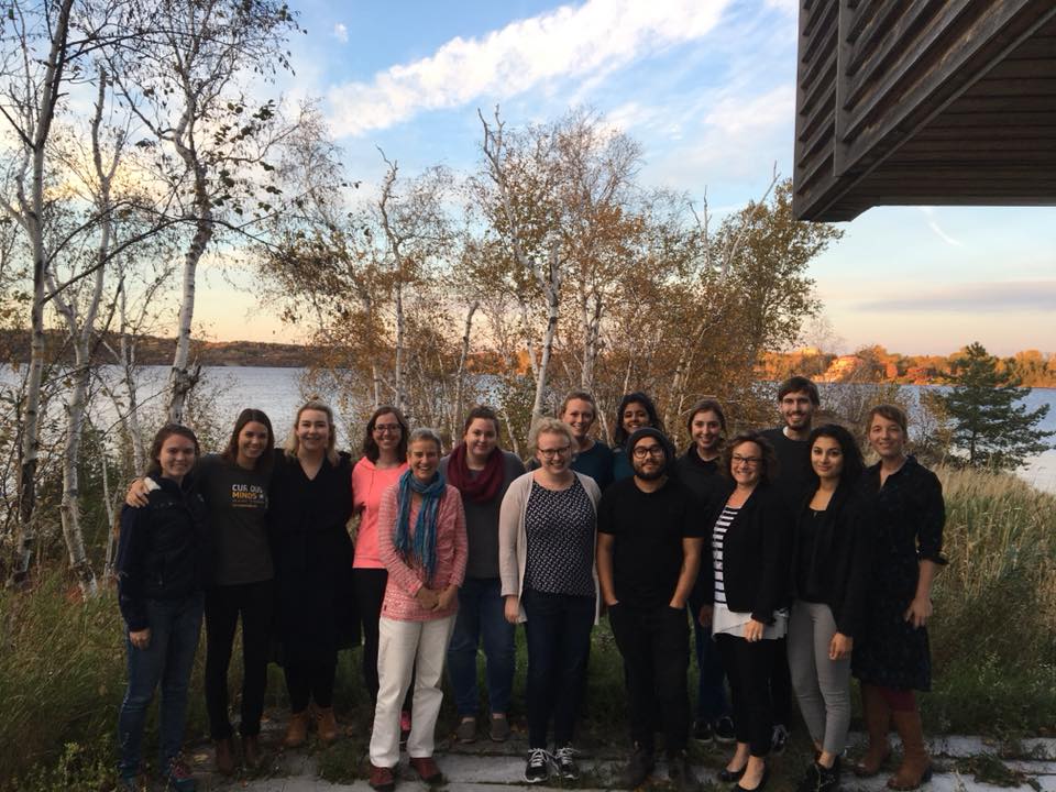
| Krolik noticed she had a problem when she came to the revelation that she had two completely separate CV’s: one for science, and one for art. Krolik realized she wanted a job that would let her do both things together. In the summer of 2010, Krolik got access to a university lab space to cultivate microbes she had collected from all around Kingston, Ontario. From there, Krolik snapped a few photos of the microbes, compiled them into a portfolio, and succeeded in landing a stand-alone exhibition at the Union Gallery in Kingston. While this launched Krolik’s career creating science art exhibits, she dreamed of making this an option for more artists. | 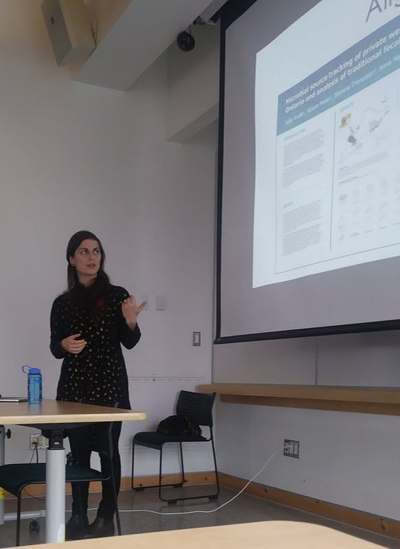 Julia Krolik talked to our class about her experiences and good infographic design. |
Art the Science
In 2015, Krolik founded Art the Science, a nonprofit organization that:
Krolik explained the third bullet point is fulfilled through an online blog that artists get invited to share their science artwork on. When the blog first started, Krolik said she had to beg people to participate, but now she regularly gets four submissions a week from artists looking to be highlighted.
In 2015, Krolik founded Art the Science, a nonprofit organization that:
- Facilitates artist residencies in scientific research laboratories across Canada
- Hosts a knowledge mobilization platform showcasing Canadian scientific and artistic excellence (called the Polyfield Gallery)
- Chronicles science-art and its cutting-edge creators in Canada and around the world
Krolik explained the third bullet point is fulfilled through an online blog that artists get invited to share their science artwork on. When the blog first started, Krolik said she had to beg people to participate, but now she regularly gets four submissions a week from artists looking to be highlighted.
| Krolik told our class how instead of explaining the artists herself, she gives each artist the same six questions and lets them write the answers. She said this keeps the artists from feeling their artwork was misrepresented (since they wrote the description themselves), plus it gives viewers a closer relation to the artists’ works, since they can see the pieces through the words of the creators. | 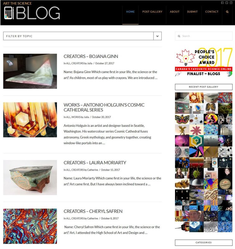 |
Then there’s the Polyfield Gallery. While the blog is meant to highlight science-art efforts, the Polyfield Gallery is meant to showcase what Krolik deems to be exceptional science-art efforts. Krolik has a few of her own on there to demonstrate the kinds of projects she looks to highlight, but additional artists are quickly being added to the collection.
| The example Krolik gave of an artist she chose to highlight was Jim Riswold. Name sound familiar? That’s because Riswold was the ad executive who worked on Space Jam! Krolik found out Riswold had created an exhibit called “Art for Oncologists*,” which involved a bunch of giant resin hearts that had different chemotherapy drug names written on them. Krolik emailed him to see if he would be interested in displaying his project on the Polyfield Gallery, and within minutes she got an affirmative “yes.” | 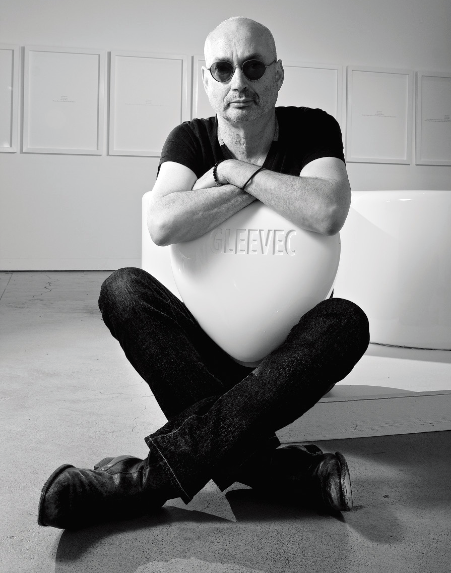 |
I highly encourage everyone to check out this exhibit HERE.
*Oncologist: a medical practitioner qualified to diagnose and treat tumors
Creating Infographics
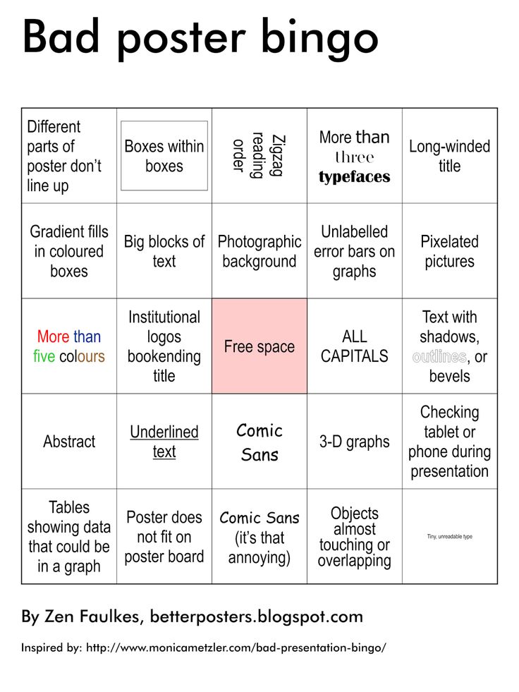
After sharing her experiences, Krolik gave a brief lecture to our class on how to create good infographics. She opened her lecture with the epitome of bad design: science posters.
I’m not talking about the cute posters with cats falling off a roof because their “mu” was too low. I’m talking about these guys:
*Oncologist: a medical practitioner qualified to diagnose and treat tumors
Creating Infographics
After sharing her experiences, Krolik gave a brief lecture to our class on how to create good infographics. She opened her lecture with the epitome of bad design: science posters.
I’m not talking about the cute posters with cats falling off a roof because their “mu” was too low. I’m talking about these guys:
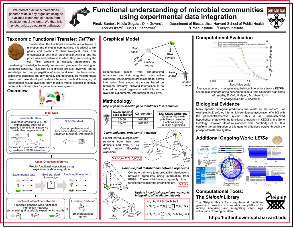
My eyes!! (To be honest, this one isn't even that bad)
While many of my fellow classmates joined this program with the intent of escaping the academic world of poster horrors, the truth is since we’ll be communicating science, the people who think this poster looks okay are the ones we’ll have to convince otherwise when we publicize their work. Here are some of the tips Krolik gave us to think about when designing infographics (or any visual work, really):
Good design is CRAP
A good design will have four key elements: Contrast, Repetition, Alignment, and Proximity. One of the hardest for scientists is Proximity. Whenever they see a bit of white space, they see it as an opportunity to cram in more information. While this might be nice when talking to other scientists, it presents a terrifying wall of text to the average person. Leaving blank spaces in a design is crucial for providing viewers clear breaks between sections and giving their eyes a chance to rest.
Design is like fashion: it changes constantly
What might be considered good design today could be thrown out the window tomorrow. Who knows, one day Comic Sans might win out yet (like this blog hopes to achieve).
Know your colors
As referenced in the CRAP above, good contrast is important for an appealing design. However, sometimes knowing what colors match is difficult, but this cool color wheel by Adobe can let you experiment with that.
Don’t justify paragraphs unless you can justify your decision
When done incorrectly, justifying paragraphs leave huge gaps in the sentences that are called “rivers,” because if water was poured on the paragraph, it would trickle right through. Unless you’re willing to spend time rephrasing the sentences to eliminate the gaps, stick with left align.
So that’s it for today! I hope you enjoyed this special guest lecture, because I certainly did. If you have time, try perusing through Art the Science, since there are some really neat things on the site (like this piece Krolik created from data points on water well locations and depths in southern Ontario).
For those of you who do attend a lot of conferences, take this with you next time:
For those of you who do attend a lot of conferences, take this with you next time:

 RSS Feed